Coincidentally, I was able to save a few of my initial sketches of Chapter 3 - Wolves before they were fully rendered. Here's a direct comparision on how the sketches are changed and added upon as they become finished pages of Ephemeris.
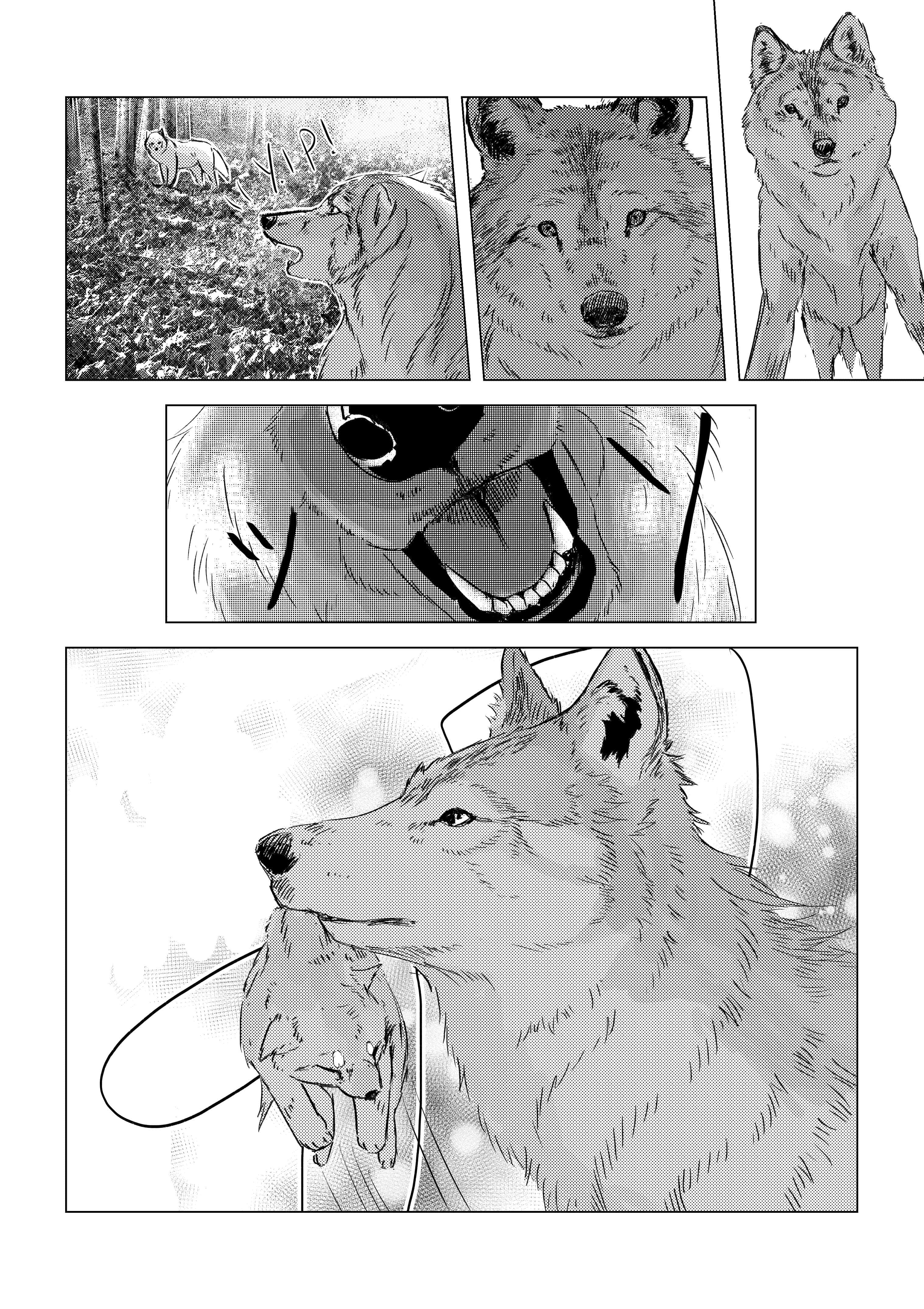
The line art for this page is quite neat from the outset. Goes to show how much the screentones and SFX contributes to the mood of the page.
There are a few differences here. I removed the paws of the wolf since I wanted to create a first-person perspective but thought it would feel a bit restrictive with the paws explicitly present. Next, the environment of the page was brought to life with the screentones. There is a concentration of darker tones towards the apex of motion, supported by the motion lines. The top of the page is framed by black leaves which produce a gradient creating the atmosphere of light filtering through the evergreen leaves. Finally the forms of the wolves are brought out by the shading as well.
Here's the first of the sketches I had dug up. You can see my sketches are pretty rough, my style is due to change but for the first three chapters of Ephemeris, in order to conserve time I generally did a rough sketch and figured out where most of the final lines would go during the inking. The sketches mainly tell me what the perspective and contents of each panel will show, like advanced thumbnailing.
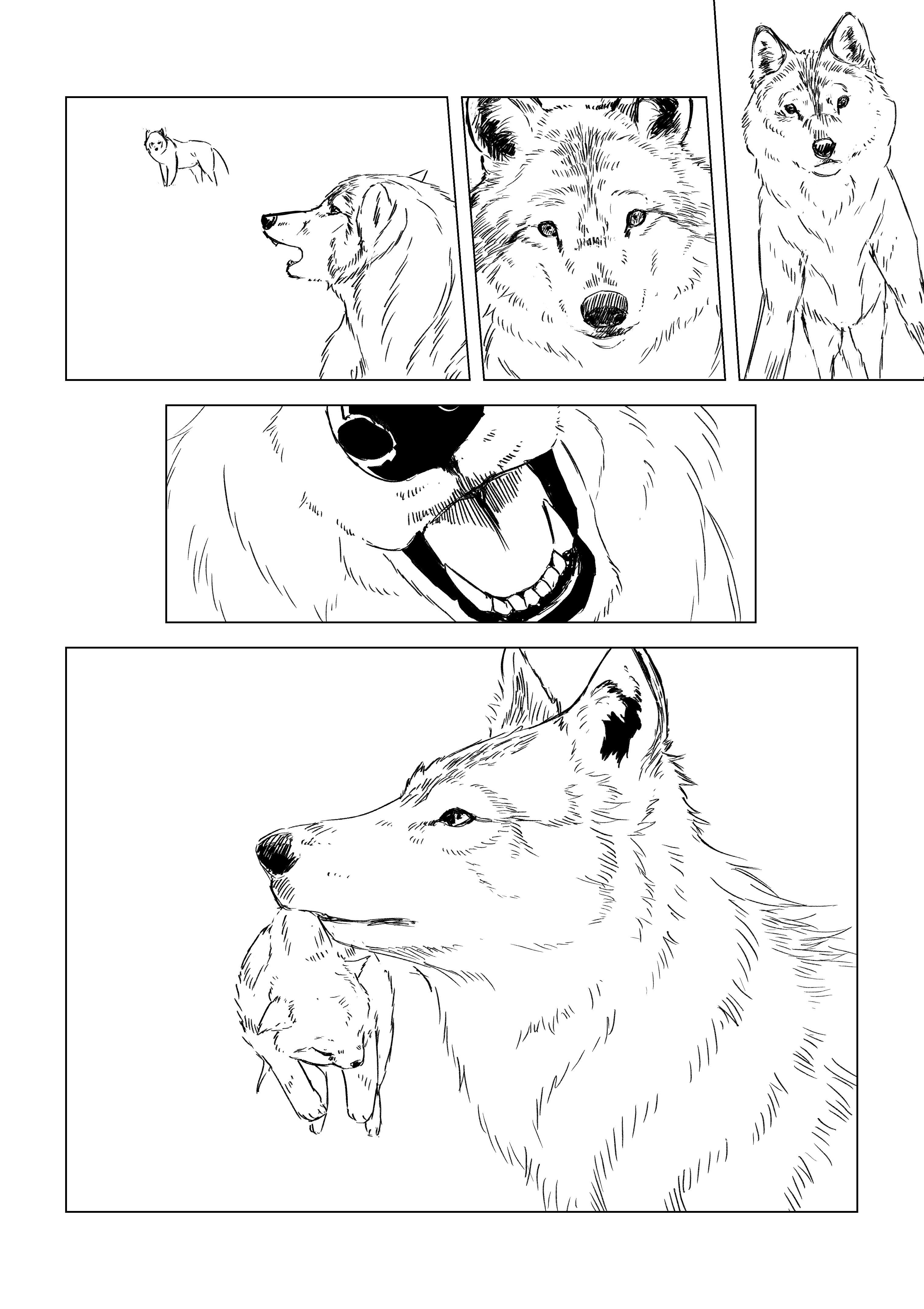
In the thumbnailing stage this was one of my favourite pages. It has slightly more than than the ideal number of panels, packing in a lot of content. As you can see I had trouble deciding the route of the top left panel. Initially it wasn't dynamic enough, and I didn't know if I wanted to split it into smaller panels because of the apparent high density. The SFX also contributes a lot to the flow of this page, as I use SFX much as a building block rather than just a superficial add on.
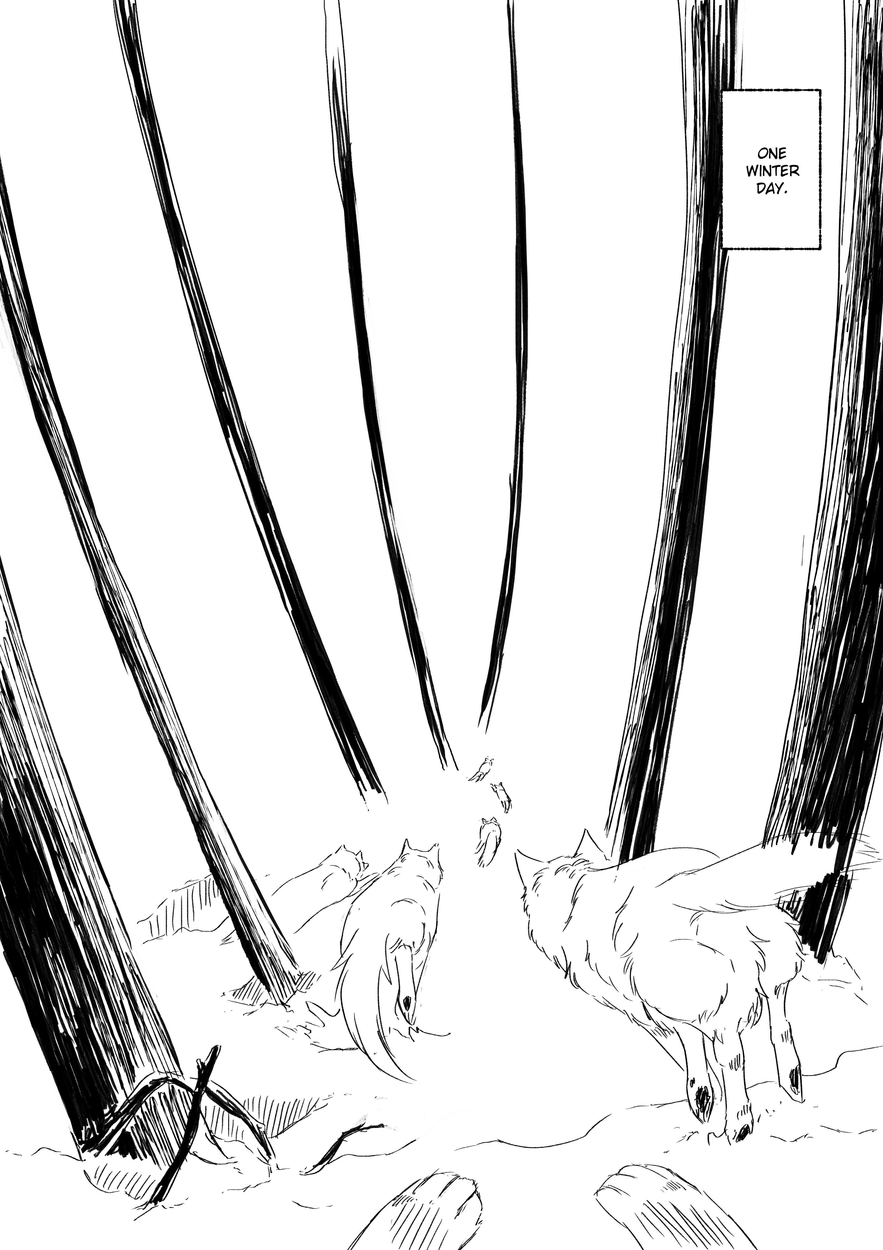
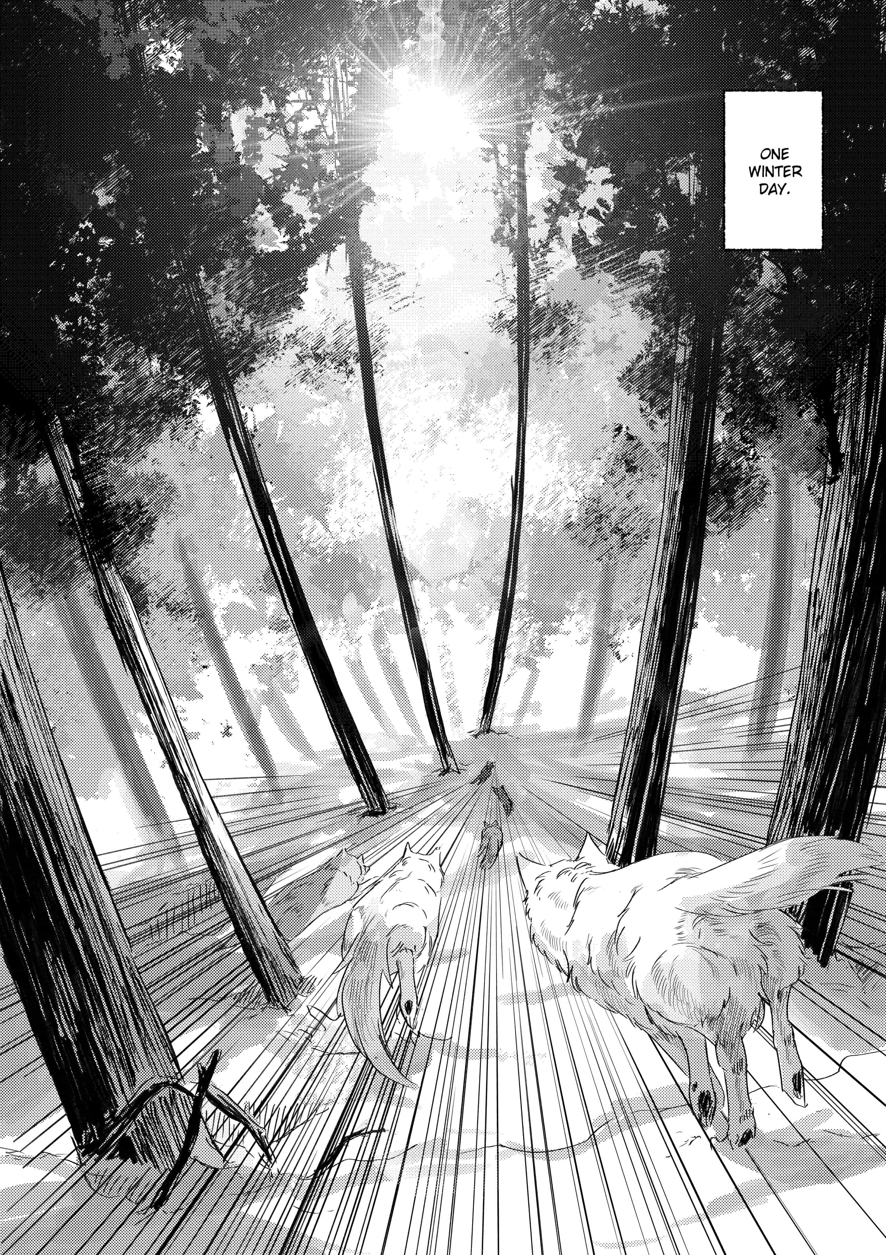
In a lot of cases I plan the SFX early, but I don't always mark it in, sometimes I keep the idea in my head until it is time to add the SFX, since it is added at the very end. As you can see I initially planned for the logs to extend out of the panel, but in execution that made the page look quite claustrophobic so in the end I extended the panel out to the edge.
Quite a few changes in this page occured from sketch to final. The top left panel was adjusted because I felt there were too many panels of a similar pose. I couldn't figure out how to make the fourth panel in the sketch more dynamic, so I ended up switching the two panels, enlarging the panel of interest to include the final, more dynamic scene.
Here you can see how the sketches are more of a thumbnail than a concrete foundation. The moose in the final page has been adjusted to make the impact with the tree feel much heavier. I also flipped the wolf in the final panel, since I realised the orientation clashed with the previous panel. Such mistakes occur quite a lot not only in manga but in media as well.
The rough idea for this page came quite early. There were small adjustments made to the angle of the neck mainly because of a lack of reference for moose heads of various angles. The initial pose would have been more dynamic. Additionally the trees were drawn at a more realistic size.
Suprisingly I got the rough idea for this perspective quite early in the process. Of course that meant it was a bit difficult to fine-tune it when it came to the actual execution. It was quite difficult to determine how to place the leaves, taking into account that these are evergreen trees. However it turned out quite well in the final version, helping to frame the action.